


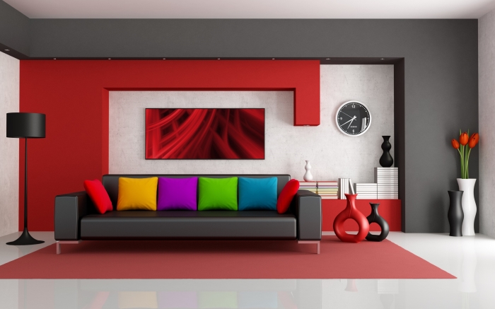
Colour
The importance of colour in throws lies in consistency. Too much of one colour can make a space feel overwhelming and heavy.
- Blue will create a cool and calming effect in a summer living room
- Reds and yellows will warm up a space during winter.
- Greens will make us feel fresh in the kitchen and purples will activate passion and focus in the office.
Using a throw with key colours in it will either create a pop of interest to the eye or can be used to pull together a room’s colour palette.
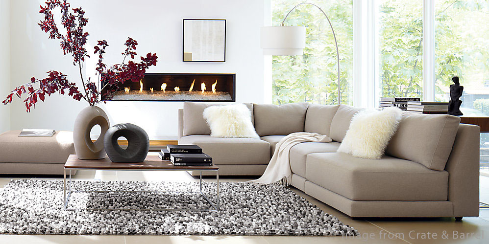
Texture
In a fairly neutral bedroom, a heavy-textured throw draped over the corner of the bed makes it appear comfy and soft—the perfect place to hide from the world and blissfully lose an afternoon.
But for a more formal style living room, you might want to drape a fur throw over the corner of a leather lounge to create a textural contrast. Always remember, heavier throws work best in block colours and neutral prints or patterns.
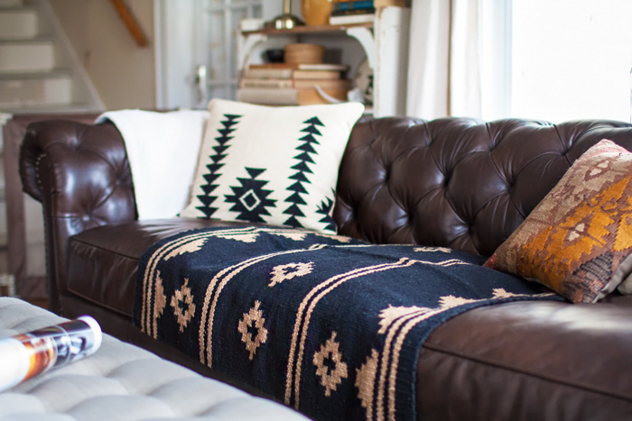
Pattern
The pattern of a throw can really dictate the style of a room and bring some flair to the space. A native print brings a bit of Boho, while a coastal print connects us to the outdoors, and a personalized illustration print may bring a bit of fun to a child’s bedroom.
Patterns come and go with seasons and trends, but it’s important to ensure the pattern you choose is a reflection of the interior style you’re trying to build. When used harmoniously, pattern is a great way to bring a dose of personality to a neutral room that may be in need of an energy lift.
Mood
Loose knit or natural fibre quality throws casually draped over the arm of an outdoor chair is an invitation to get comfortable with a book while keeping the evening chill at bay. Even, a throw with a classic print and neatly folded over the arm of a sofa alludes to intricacy and formality.
![]()


